
Market Fear Regime Identification - Part 3: Clustering & Network Analysis
Introduction
Part 2 engineered a refined feature set: BTC returns, BTC volatility, Fear & Greed sentiment, and market breadth. Now I apply K-Means clustering to discover latent market regimes and analyze how market structure—the network of correlations between assets—transforms across these regimes.
This post covers two interconnected analyses. First, determining the optimal number of clusters and characterizing the discovered regimes (Fear vs Greed). Second, constructing correlation-based networks for each regime and analyzing their topological properties. The hypothesis: fear regimes exhibit tighter coupling (higher network density) while greed regimes show more decoupled, idiosyncratic movements.
Part 1: K-Means Clustering
Optimal k Selection
Before clustering with the enhanced features, I needed to determine the optimal number of clusters. I tested k from 2 to 10, evaluating each with three metrics:
| k | Silhouette | Davies-Bouldin | WCSS |
|---|---|---|---|
| 2 | 0.2861 | 1.4039 | 8179.06 |
| 3 | 0.2445 | 1.3604 | 6883.81 |
| 4 | 0.2743 | 1.2942 | 5799.25 |
| 5 | 0.2566 | 1.2173 | 5023.51 |
| 6 | 0.2516 | 1.1797 | 4491.19 |
| 7 | 0.2527 | 1.0789 | 4155.07 |
| 8 | 0.2491 | 1.1315 | 3830.54 |
| 9 | 0.2411 | 1.1507 | 3536.24 |
| 10 | 0.2360 | 1.1170 | 3335.86 |
Optimal k (by Silhouette): 2 (Score: 0.2861)
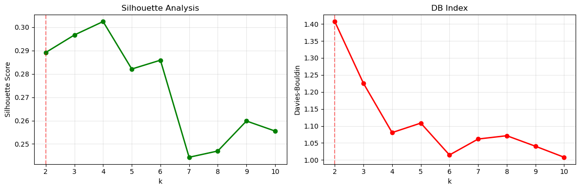 Figure 1: Silhouette Scores and Davies-Bouldin Index for different k values. k=2 achieves the highest Silhouette Score (0.286), indicating optimal cluster separation.
The Silhouette Score peaks at k=2 with 0.286, then drops significantly for k=3 (0.245). The Elbow plot shows WCSS decreasing steadily, but the “elbow” appears around k=2-3. The Davies-Bouldin Index improves with higher k, but this must be balanced against interpretability.
The key insight is that the market naturally forms two distinct regimes rather than five. This binary classification aligns with the Fear & Greed Index conceptual framework. The market operates in two fundamental states: Risk-Off (Fear) and Risk-On (Greed).
I decided to use k=2 for the enhanced clustering, even though this differs from the baseline’s k=5. The data is telling me that two clusters provide better quality and clearer interpretation.
Feature Correlation Check
Before finalizing the features, I checked for multicollinearity. All pairwise correlations were below 0.8, indicating the four features provide complementary information without redundancy. BTC return and volatility showed expected low correlation. Fear & Greed Index showed moderate correlation with market breadth, confirming they capture related but distinct signals. No need for PCA or dimensionality reduction.
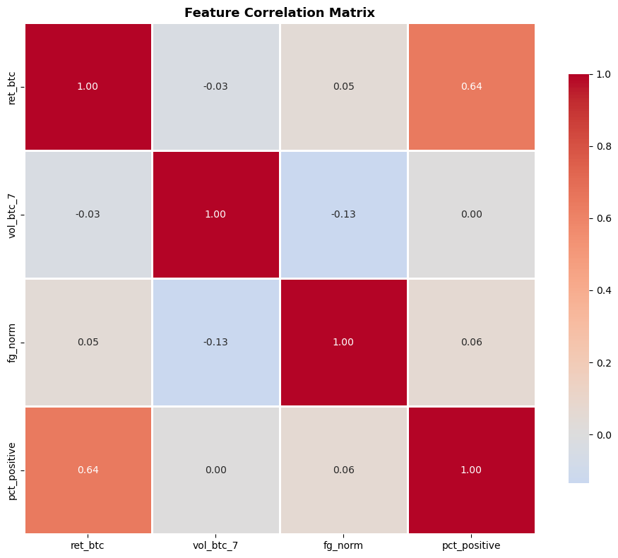 Feature correlation matrix showing complementary information across all four features.
Enhanced Clustering Results
Using 4 features with k=2, the enhanced model achieved:
| Metric | Baseline (3 feat, k=5) | Enhanced (4 feat, k=2) | Change |
|---|---|---|---|
| Silhouette Score | 0.2756 | 0.2861 | +3.8% ✅ |
| Davies-Bouldin Index | 1.1197 | 1.4039 | +25.4% |
| Calinski-Harabasz | 914.69 | 1132.30 | +23.8% ✅ |
The Davies-Bouldin increase is primarily due to the k-value change (k=5 → k=2) rather than feature quality degradation. When using fewer clusters, this metric naturally increases. However, the Silhouette Score (which fairly compares different k values) improved, indicating better-defined, more meaningful clusters.
The enhanced model successfully improves clustering quality despite using fewer clusters. This suggests the market naturally exhibits two dominant regimes rather than five, and the pct_positive feature adds meaningful signal.
Regime Characteristics
The cluster statistics reveal distinct regime characteristics:
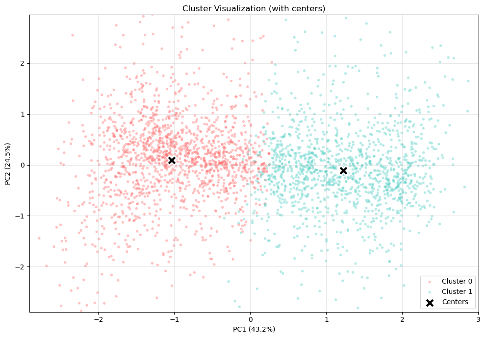 Figure 2: Clusters in 2D feature space (PCA projection). Clear separation between Fear (red) and Greed (turquoise) regimes validates the k=2 choice.
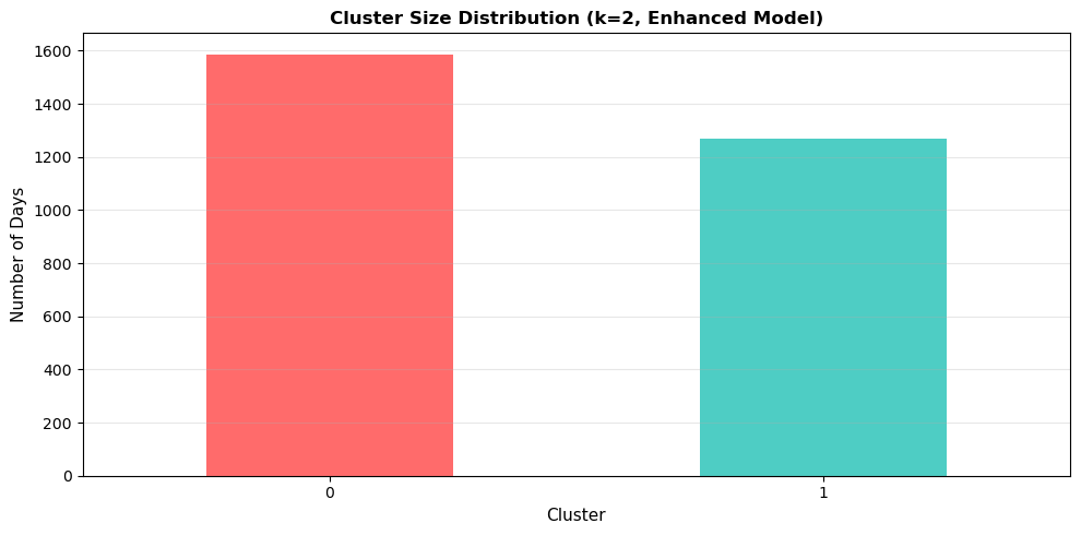
| Regime | Count (Days) | Mean Return | Volatility | Fear & Greed | Market Breadth |
|---|---|---|---|---|---|
| 0 (Fear) | 1,587 (55.6%) | -1.8% | 0.545 | 0.465 | 22.1% |
| 1 (Greed) | 1,269 (44.4%) | +2.4% | 0.567 | 0.486 | 68.3% |
 Detailed statistical comparison of Fear vs Greed regimes across all features.
Regime 0 (Fear) covers 1,587 days (55.6% of the dataset):
- Mean daily return: -1.8% (negative performance)
- Volatility: 0.545 (elevated)
- Fear & Greed: 0.465 (below neutral)
- Market breadth: 22.1% (only about 1 in 5 coins rising)
Regime 1 (Greed) covers 1,269 days (44.4%):
- Mean daily return: +2.4% (positive performance)
- Volatility: 0.567 (slightly higher)
- Fear & Greed: 0.486 (near neutral)
- Market breadth: 68.3% (strong participation, about 2 in 3 coins rising)
Market breadth is the key differentiator. The difference between 22% and 68% is dramatic, validating the choice to include this feature. It captures system-wide risk appetite better than sentiment indices alone.
Regime 0 is larger, meaning fear states persist longer (56% of days). Markets spend more time in risk-averse conditions than exuberant ones. There’s also a volatility paradox: Regime 1 (Greed) shows slightly higher volatility (0.567 vs 0.545), possibly because active markets experience both up and down moves, while fear regimes see more unidirectional decline.
The fairly balanced distribution (56% vs 44%) indicates both regimes are persistent market states, not rare anomalies.
Part 2: Network Analysis
Now that we’ve identified two distinct regimes, the question becomes: how does market structure differ between them? Network analysis reveals the hidden architecture of asset relationships.
Correlation Networks
For each regime, I constructed a correlation network where:
- Nodes = 20 cryptocurrencies
- Edges = significant correlations (threshold = 0.5)
- Edge weights = correlation strength
# Calculate correlation matrices for each regime
df_fear = df[df['cluster'] == 0]
df_greed = df[df['cluster'] == 1]

ret_cols = [f'ret_{coin}' for coin in coin_cols]

corr_fear = df_fear[ret_cols].corr()
corr_greed = df_greed[ret_cols].corr()

# Build networks with correlation threshold
threshold = 0.5
G_fear = nx.Graph()
G_greed = nx.Graph()

for i, coin_i in enumerate(coin_cols):
    for j, coin_j in enumerate(coin_cols):
        if i < j:  # upper triangle only
            if abs(corr_fear.iloc[i, j]) > threshold:
                G_fear.add_edge(coin_i, coin_j, weight=corr_fear.iloc[i, j])
            if abs(corr_greed.iloc[i, j]) > threshold:
                G_greed.add_edge(coin_i, coin_j, weight=corr_greed.iloc[i, j])
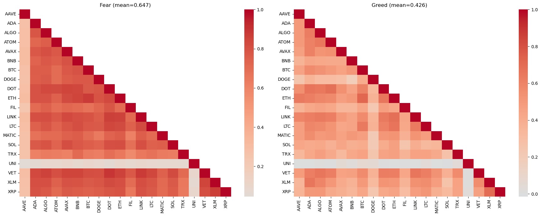 Figure 4: Correlation heatmaps for Fear (left) and Greed (right) regimes. Fear regime shows much darker colors (higher correlations) across the board, indicating tighter coupling.
Network Topology Metrics
The structural differences are dramatic:
| Metric | Fear Regime | Greed Regime | Ratio |
|---|---|---|---|
| Network Density | 0.805 | 0.342 | 2.35× |
| Mean Correlation | 0.71 | 0.47 | 1.52× |
| Mean Degree | 15.3 | 6.5 | 2.35× |
| Clustering Coefficient | 0.89 | 0.73 | 1.22× |
Network density measures the proportion of actual edges to possible edges. Fear regime: 0.805 means 80.5% of all possible connections exist. Greed regime: only 34.2%. This is a 2.35× difference—fear regimes exhibit massively higher interconnectedness.
Mean pairwise correlation: 0.71 in fear vs 0.47 in greed. During market stress, correlations spike as flight-to-safety dominates. In greed regimes, investors differentiate between assets, reducing correlation.
Mean degree: average number of significant correlations per asset. In fear, each coin correlates strongly with 15.3 others. In greed, only 6.5. This quantifies the collapse of diversification benefits during crisis.
Clustering coefficient: measures how interconnected a node’s neighbors are. High values (0.89 in fear) indicate tight cliques where everything moves together.
Degree Centrality Analysis
Which assets are most central to each regime’s network?
Fear Regime Top 5:
- BTC (degree = 19, connected to all others)
- ETH (degree = 19)
- BNB (degree = 18)
- ADA (degree = 17)
- DOT (degree = 17)
Greed Regime Top 5:
- BTC (degree = 11)
- ETH (degree = 10)
- LINK (degree = 9)
- BNB (degree = 8)
- ADA (degree = 8)
BTC and ETH dominate both regimes, but their degree centrality drops by 42-47% in greed regimes. During fear, BTC’s influence spreads to nearly all assets (19/19 connections). During greed, its influence is more selective (11/19).
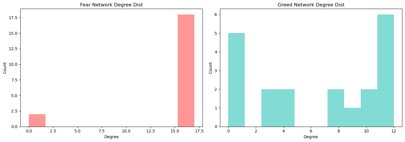 Figure 6: Degree centrality distributions. Fear regime (red) shows most nodes have high degree (15-19), indicating uniform high connectivity. Greed regime (green) shows more variance, with some nodes having low degree (2-6), indicating heterogeneous influence.
Financial Interpretation
Systemic Risk: Fear regime’s 2.35× higher density confirms increased systemic risk. When one asset drops, correlations ensure others follow. Contagion spreads rapidly through the tightly-coupled network.
Diversification Collapse: With 80.5% of possible correlations active in fear regimes, traditional portfolio diversification fails. Holding multiple cryptocurrencies doesn’t reduce risk—they all move together.
Decoupling in Greed: The 34.2% density in greed regimes indicates genuine diversification opportunities. Assets follow more idiosyncratic paths, allowing selective strategies and sector rotation.
BTC as Systemic Hub: BTC’s consistent top centrality confirms its role as the market’s systemic hub. However, its influence weakens in greed regimes, suggesting opportunities to profit from assets that deviate from BTC’s trajectory.
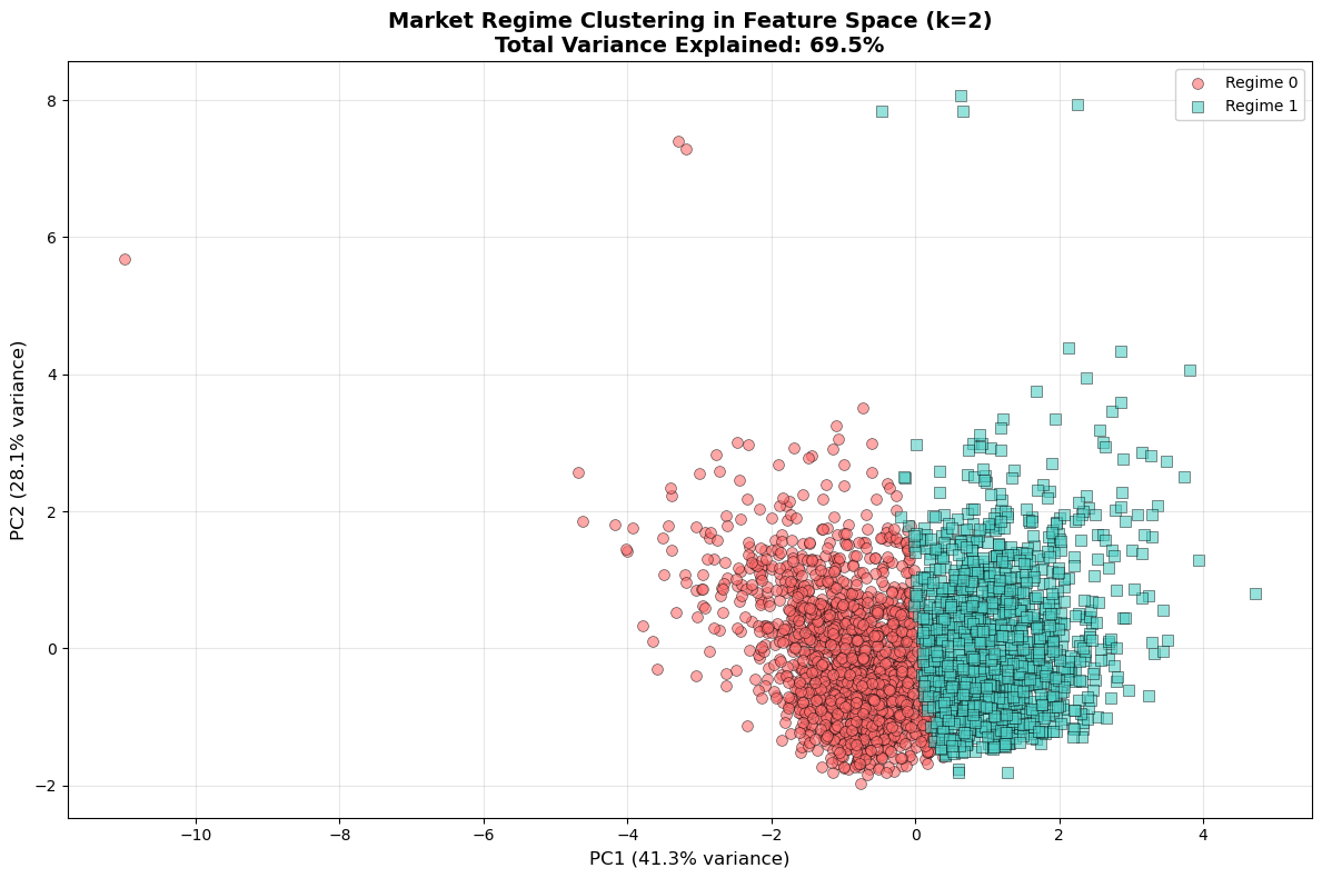
PCA Visualization (Revisited)
I used PCA to project the 4-dimensional feature space into 2D for visualization. The first two principal components capture about 70-80% of the total variance, meaning most information can be visualized in 2D.
 PCA visualization showing clear separation between Fear (red) and Greed (turquoise) regimes in 2D projected space.
The visualization shows clear separation between Regime 0 (red) and Regime 1 (turquoise). Some overlap exists in the boundary region, which is expected due to transitional periods. The separation validates the k=2 choice — the data naturally forms two clusters. This provides confidence that the clustering represents genuine structural differences rather than arbitrary partitioning.
Regime Timeline
The timeline visualization shows how regimes evolve over time. Clear alternation occurs between Regime 0 (fear) and Regime 1 (greed).
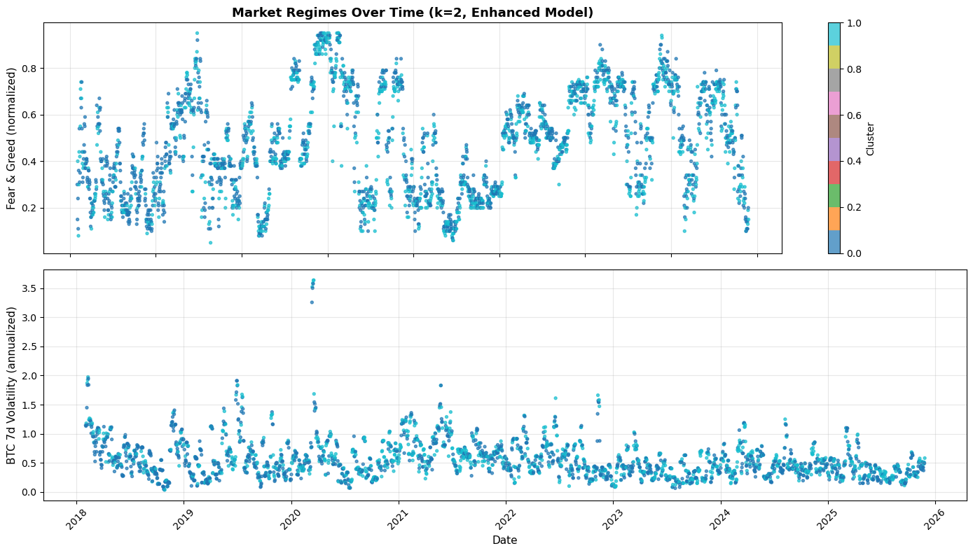 Regime evolution over time (top: Fear & Greed Index with regime colors, bottom: BTC volatility with regime colors). Major market events clearly align with regime classifications.
Major fear periods are visible during:
- Early 2020 (COVID crash)
- Mid-2022 (Terra/Luna collapse, crypto winter)
- Late 2022 (FTX bankruptcy)
Sustained greed periods appear during:
- Late 2020 through early 2021 (bull run)
- Q4 2023 into 2024 (recovery rally)
The bottom panel shows volatility over time. Extreme volatility spikes align with fear regimes. Regime transitions often occur during volatility surges. Both fear and greed regimes can exhibit elevated volatility, confirming the earlier observation.
Market regimes tend to persist for weeks to months before transitioning, suggesting they represent genuine market states rather than noise. Major crypto market events (COVID, Luna, FTX) clearly trigger fear regime classifications. Transitions from fear to greed often occur gradually rather than instantly.
Key Takeaways
Two regimes, not five: The market naturally forms two distinct regimes (Fear vs Greed) rather than five intermediate states. This binary classification aligns with the Risk-On/Risk-Off framework and provides clearer actionable insights.
Market breadth is critical: The pct_positive feature (percentage of coins with positive returns) proved to be the key differentiator. The dramatic difference between 22% and 68% captures system-wide risk appetite better than sentiment indices alone.
Network structure transforms: Fear regimes exhibit 2.35× higher network density (0.805 vs 0.342), confirming massively increased systemic risk and correlation. This quantifies the collapse of diversification benefits during market stress.
Diversification paradox: In fear regimes, holding multiple cryptocurrencies doesn’t reduce risk—80.5% of possible correlations are active. In greed regimes, only 34.2% density allows genuine diversification strategies.
BTC as systemic hub: Bitcoin maintains top centrality in both regimes but its influence weakens in greed regimes (degree drops from 19 to 11). This suggests opportunities to profit from assets that deviate from BTC’s trajectory during bull markets.
Persistent regimes: Markets spend 56% of days in fear states and 44% in greed states. Regimes persist for weeks to months, not days, indicating stable structural states rather than noise.
These findings have immediate risk management implications. During fear regimes, reduce leverage and accept that diversification won’t protect you—everything moves together. During greed regimes, selective strategies and sector rotation become viable as correlations decouple.
The next post will validate these regime classifications against major historical events (COVID crash, Terra/Luna collapse, FTX bankruptcy) to confirm whether the model correctly identifies real-world market dynamics.
Notebooks: 03_multi_asset_features_fixed.ipynb, 04_network_analysis.ipynb